Wednesday, June 18, 2014

The Awesomeness of PowerPoint

If you've ever been a corporate drone like myself, you've probably grown used to being bludgeoned to death with PowerPoint (PPT) pitches.  It's approaching the point where PPT deserves its own article under the Hague Conventions, next to the chemical weapons and frangible bullets. 

But PPT is also incredibly flexible and useful for drawing, and that's what makes it of value to the wargaming community.  PPT has a lot of the tools built into it which make for easy illustrations, line drawings, etc., that can be difficult to do in Photoshop and Illustrator (I can't speak for CorelDraw, as I've never used it).  Using the "Edit Points", "Align", "Glow", "Group", and other functions makes for easy and fairly accurate work for someone who otherwise has the artistic prowess of an epileptic clam.

Take, for instance, the below examples.

Blips

I love blips.  I've loved them ever since I first played Space Hulk back in the late '80s (insert cheap shot about modern Games Workshop versus '80s GW here).  There was something ominous and foreboding about watching those inscrutable blip markers converging on your Marine squad.

Here are some blips from around the web:


Pretty nice stuff.  Now here are some that I made using nothing but PPT:

Original size:

And a size more suitable for gaming:


Here is one that more closely resembles the motion-tracker HUD from "Aliens" (possibly one of the best movies ever made):


Silhouettes

On a complete whim (and in the middle of my divorce, when I needed some distraction), I made up a number of silhouettes of Brigade Models' 6mm and 15mm vehicles.  I won't burden you with the dozens upon dozens of designs, but here are a couple examples (again, made solely using PPT):


Maps

Below are two of the dozen or so maps I had made for a pack of Dirtside II scenarios (which I had started to adapt for Brigade's Iron Cow 2103 rules in an as-yet-unfinished supplement called Operation Starlight):


One of the upsides of using PPT is that you can easily duplicate and then tailor specific shapes.  For example, the dashed yellow dividing line on the highway above is the same line as the highway itself, copied and pasted on top of the highway line.  The Format options were then used to make them each serve their own purpose:  the highway line was set to Black, 12 Point weight, Solid, while the dividing line was set to Yellow, 1.5 Point weight, Dash. 

The trees are obviously just the Cloud Callout shape with a dark-to-light green gradiant fill!  I was too lazy to make individual trees.

Speaking of Operation Starlight, here is the cover page for it, which was done in Word with graphics drawn in PPT:


Some other random things that I did for the OpStar project using PPT include these unit patches for mythical futuristic units from the Iron Cow fluffyverse:

This is the CDSU People's Liberation Army 6th Armored Division crest:


It was based off a real-life ChiComm unit patch that had the outline of what looks like a T-55 or T-62 on it;  I replaced it with a line-drawing of Brigade's Zhu De main battle tank (a GEV tank, hence the hoverskirts on the above patch).  Here is the actual PLA 6th AD unit patch:


Here is the NeoSoviet 191st Motorized Rifle Division's unit crest:


Not the best, but not horrible, by any means.

Unit Cards

Below are a couple unit cards I made in PPT and then embedded in an Excel spreadsheet for Stargrunt II.  Once in Excel, I used text boxes linked to the formulas in hidden cells that were overlaid on the cards, so that when the user changes an option or value on the unit-builder sheet, the values on the data card appear to update themselves automatically.


Other Stuff

There is a ton more I could say and share about the awesomeness of PPT, but you have much to do and have probably wasted way too much time here already.  So, here are a last couple items for your perusal.

Slot-floor stamp:  I drew this and sent it off to www.rubberstamps.net (who, by the way, are fantastic to deal with) to get a custom stamp made so that I could quickly add texture to my Litko 15mm space corridors:


Fighter tokens:  I designed these to have them laser-etched into acrylic by Litko:


Map banners:  These are intended for the headers of pages in the Operation Starlight booklet.  I love military maps, being a former grunt, and I think they make great decorative touches for wargaming-related projects.


Sci-fi soldier silhouette:  No worries;  I won't inflict any further alliteration on you!  This is a well-known clipart and TrueType Font silhouette of a solder kneeling and aiming.  I decided to sci-fi it (yes, that is now officially a verb, but not to be confused with "SyFying" something, which means to take a decent concept and make it suck) by adding to the rifle and putting a small aerial on the guy's helmet.


Anyway, that's all, folks!  Thanks for putting up with me whilst I proclaim the virtues of the much-derided but misunderstood animal that is PowerPoint!


Wednesday, June 11, 2014

Boardgame Concept: Settlers of CaTron

I love Settlers of Catan. It uses simple yet amazingly clever and deep resource management mechanics to provide endless replayability. I was thrilled to get the Star Trek Catan version for my youngest son a couple Christmasses ago, and it got me to thinking about what other properties could be readily adapted to the Catan model.

Enter Disney's classic sci-fi flick, TRON.

Any geek who would subject themselves to reading this blog likely knows what Tron is all about, so I'm not going to belabor that point. Rather, let's get to the eye candy of my homebrewed adaptation of the Catan game to the Tron universe.

I give you:


To begin with, Catan uses five resources: Lumber, Sheep, Brick, Wheat, and Ore. My ideal version would replace those with:

Energy
(replaces Lumber)

Hex Tile:


Resource Card:


Bits
(replaces Sheep)
 
Hex Tile:


Resource Card:

 
Grid
(replaces Brick)

Hex Tile:

Resource Card:

 
RAM
(replaces Wheat)

Hex Tile:
 

Resource Card:


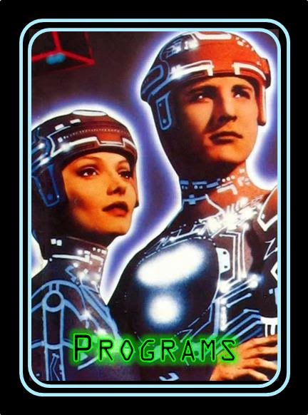
Programs
(replaces Ore)

Hex Tile:
 
Resource Card (I love this pic):


Once we have those five resources, we then have the pieces. My thought would be that these would be best done in transparent acrylic, the kind that really catches the light and glows at the edges.

Roads

The coolest and most logical choice for the roads would be Light Cycles with a section of wall behind them. Please forgive my line-drawings; I have next to no artistic ability.


Settlements

I have to admit that I wasn't sure what to do with these. For the moment, I'm calling them "Junctions" and they'll be just a six-pointed convergence of roads. I'm sure I can come up with something better, given the time and another viewing of Tron.


Cities

I knew exactly what I wanted with this one: the Input/Output Tower where Flynn, Tron, and Yori meet the grizzled old man-program. Here is the screenshot from the film:


The pieces would be something like that (again, please forgive my pathetic line drawings).


Thief

This one was a no-brainer! What better Thief marker than the ominous, red-glowing Recognizer? This baby would be beautiful in etched transparent red acrylic.


Development Cards.

In Catan, the five types of Development Cards are:

1. Year of Plenty
2. Monopoly
3. Road Builder
4. Knight
5. Victory Point

In CaTRON, I've envisioned those as such:

1. Data Dump
(replaces Year of Plenty)

 
2. Command Override
(replaces Monopoly)


3. Solar Sailer
(replaces Road Builder)

 
4. Video Warriors
(replaces Knight)


5. Victory Point


Then there are the two special achievement cards, Largest Army and Longest Road.

1. Largest Army

2. Longest Circuit
(replaces Longest Road)


And that's it. The game plays exactly the same as regular Catan. I hadn't gotten to the point of considering special characters, Seafarers, etc. This was enough fun for me on this topic.

The Deluxe Edition should have David Warner narrating the cards.  If you're going to dream, might was well dream big, right?

Tuesday, June 10, 2014

6mm Moon Buggy

This was a bit of a vanity project in response to a post on Theminiaturespage.com.  I've always loved the BBC's short-lived-but-excellent sci-fi crime series, "Star Cops", especially as they tried hard to keep the technology within the realm of today's tech.  No phasers, matter transporters, or reliance on handwavium!  The spartan aesthetic that resulted definitely made it feel like the series could have been happening right now.

The Star Cops moon buggy is a perfect example.  It takes the bare-bones feel of the Apollo lunar rovers and mates it up with the gypsy-wagon feel of so many frontier-bound vehicles, resulting in an intriguing and functional buggy that could easily have just rolled out of the hangar at Cape Canaveral.

Here is a screenshot of the original:


And an amzing model someone built:


(credit to http://www.eagletransporter.com/forum/showthread.php?p=343636)

And here is my 6mm version.  I really wish I could add more in the way of detail, but with the limits on 3D printing, this was about as good as it could get: